Plotting for Data Science & ML
Data without visualization is just noise. This guide covers everything from the foundational mechanics of Matplotlib to the statistical power of Seaborn and the interactivity of Plotly. Master these, and you will excel in any ML or DS role.
Introduction
What is a plot?
The Big Three Libraries
In the Python data science ecosystem, plotting is dominated by three main libraries, each serving a distinct purpose:
The absolute foundation. It is low-level, extremely customizable, and powerful. You must know Matplotlib to succeed in DS, as almost everything else is built on top of it.
Built on top of Matplotlib, Seaborn provides a high-level interface for drawing attractive and informative statistical graphics (like heatmaps and pairplots). It requires significantly less code than Matplotlib.
Unlike Matplotlib, Plotly renders in the browser using JavaScript. It allows for highly interactive plots (zooming, hovering, panning) which is essential for presenting data to stakeholders or exploring dense datasets.
The Core Plot Types
1. Scatter Plot
A scatter plot uses dots to represent values for two different numeric variables. The position of each dot on the horizontal and vertical axis indicates values for an individual data point.
2. Line Graph
A line graph connects individual data points with line segments. It displays quantitative values over a continuous interval or time period.
3. Bar Graph
A bar graph presents categorical data with rectangular bars with heights or lengths proportional to the values that they represent.
4. Histogram
A histogram is an approximate representation of the distribution of numerical data. It divides the entire range of values into a series of intervals (bins) and counts how many values fall into each bin.
Plot Types, Visualized
Click any plot type to see it rendered live
Matplotlib Mechanics
How to Plot Data
Matplotlib has two interfaces: the Pyplot (state-based) interface, and the Object-Oriented (OO) interface. In ML, you should always use the Object-Oriented interface (`fig, ax = plt.subplots()`) as it gives you explicit control over your axes.
import matplotlib.pyplot as plt
import numpy as np

# 1. Generate some data
x = np.linspace(0, 10, 100)
y = np.sin(x)

# 2. Create Figure and Axes (Object-Oriented API)
fig, ax = plt.subplots(figsize=(8, 4))

# 3. Plot the data
ax.plot(x, y)

# 4. Display
plt.show()
How to Label a Plot
Never leave a plot unlabeled. You must set the title, x-axis label, y-axis label, and include a legend if multiple elements are present.
ax.plot(x, y, label='Sine Wave')

# Labeling the axes and title
ax.set_title('Signal Strength over Time')
ax.set_xlabel('Time (seconds)')
ax.set_ylabel('Amplitude')

# Show the legend (uses the label parameter from .plot)
ax.legend(loc='upper right')
How to Scale an Axis
Often in Data Science, data spans multiple orders of magnitude (like income or exponential growth). You will need to scale your axis or set absolute limits.
# Setting explicit limits for the X and Y axes
ax.set_xlim(0, 10)
ax.set_ylim(-1.5, 1.5)

# Changing the scale to logarithmic (crucial for skewed ML data)
ax.set_xscale('log')
ax.set_yscale('linear')
How to Plot Multiple Sets of Data
To plot multiple sets of data on the same graph, simply call the plot function multiple times on the same `ax` object before calling `plt.show()`.
fig, ax = plt.subplots()

# Plotting multiple lines on the same axes
ax.plot(epochs, train_loss, color='blue', label='Training Loss')
ax.plot(epochs, val_loss, color='red', linestyle='--', label='Validation Loss')

ax.set_title('Model Training History')
ax.legend()
plt.show()Seaborn (Statistical Data Viz)
Seaborn shines when you need to visualize complex statistical relationships in pandas DataFrames with minimal code. It automatically handles labeling and provides stunning color palettes.
Before training any model, Data Scientists use Seaborn's `heatmap` to check feature correlation. If two features are perfectly correlated (multicollinearity), one should be dropped!
import seaborn as sns

# Assume 'df' is a Pandas DataFrame with housing data
corr_matrix = df.corr()

# Plotting a heatmap of correlations
plt.figure(figsize=(10, 8))
sns.heatmap(corr_matrix, annot=True, cmap='coolwarm')
plt.title('Feature Correlation Heatmap')
plt.show()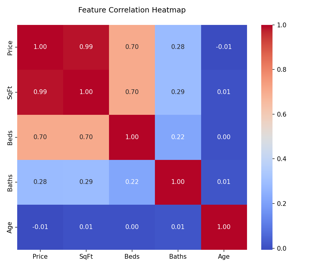
Plotly (Interactive Visualizations)
When presenting models to non-technical stakeholders, static images often fall short. Plotly allows the user to hover over data points to see exact values, zoom into dense clusters, and toggle datasets on and off via the legend.
import plotly.express as px

# Plotly Express allows building interactive plots in one line of code
fig = px.scatter(df, x="sepal_width", y="sepal_length", color="species",
                 title="Interactive Iris Dataset")
fig.show()
Interactive Plotly Demo: Loss Curves
Hover over the lines to see exact loss values per epoch. You can click the legend items to toggle the training or validation loss visibility.
Essential ML Workflows
Learning Curves
A Learning Curve is a line plot showing the model's loss or accuracy on both the training and validation datasets over time (epochs) or over varying amounts of training data. It is the primary tool for diagnosing bias (underfitting) and variance (overfitting).
If your training loss continues to decrease, but your validation loss begins to increase, your model is memorizing the training data. You should apply early stopping, dropout, or regularization.
import matplotlib.pyplot as plt

# Plotting a Learning Curve with Matplotlib
fig, ax = plt.subplots(figsize=(8, 5))

ax.plot(epochs, train_loss, label='Training Loss', color='blue')
ax.plot(epochs, val_loss, label='Validation Loss', color='red', linestyle='--')

ax.set_title('Model Learning Curve')
ax.set_xlabel('Epochs')
ax.set_ylabel('Loss')
ax.legend()
plt.show()
The Confusion Matrix
For classification tasks, accuracy is rarely enough. A Confusion Matrix visualizes True Positives, True Negatives, False Positives, and False Negatives. In ML, we usually use Seaborn's heatmap to make this readable.
from sklearn.metrics import confusion_matrix
import seaborn as sns

# Calculate confusion matrix
cm = confusion_matrix(y_true, y_pred)

# Plot using Seaborn
plt.figure(figsize=(6, 5))
sns.heatmap(cm, annot=True, fmt='d', cmap='Blues')
plt.title('Confusion Matrix')
plt.xlabel('Predicted Label')
plt.ylabel('True Label')
plt.show()
ROC Curve & AUC
The Receiver Operating Characteristic (ROC) curve plots the True Positive Rate against the False Positive Rate at various threshold settings. The Area Under the Curve (AUC) provides an aggregate measure of performance across all possible classification thresholds.
Feature Importance
Tree-based models (like Random Forest or XGBoost) provide "feature importances". A horizontal bar chart is the industry standard for visualizing which features drove the model's predictions.
# Assuming 'importances' is a NumPy array and 'features' is a list of strings
fig, ax = plt.subplots(figsize=(10, 6))

# Horizontal bar chart
ax.barh(features, importances, color='#1B4F72')
ax.set_xlabel('Relative Importance')
ax.set_title('Random Forest Feature Importance')

# Invert y-axis to show the most important feature at the top
ax.invert_yaxis()
plt.show()Exploratory Data Analysis (EDA)
Before training a model, an ML Engineer must understand the shape of the data. Seaborn is the absolute standard for EDA plotting.
Box Plots for Outlier Detection
Box plots visualize the median, quartiles, and most importantly, the outliers of a distribution. Outliers often need to be capped, scaled, or removed before feeding data into linear models or neural networks.
# Using Seaborn to plot a box plot of house prices by neighborhood
plt.figure(figsize=(10, 6))
sns.boxplot(x='neighborhood', y='price', data=df)
plt.title('Distribution of House Prices (Detecting Outliers)')
plt.xticks(rotation=45)
plt.show()
Violin Plots
Violin plots combine a Box Plot with a Kernel Density Estimation (KDE) plot. They show the exact probability density of the data at different values, giving you much more information than a simple box plot.
# Violin plots handle multimodal distributions (data with multiple peaks) gracefully
sns.violinplot(x='species', y='sepal_length', data=iris_df, palette='muted')
plt.show()
Pairplots
When you first receive a dataset, a Pairplot allows you to plot pairwise relationships across the entire dataframe at once. It plots scatter plots for joint relationships and histograms for univariate distributions.
# Warning: This is extremely computationally heavy on datasets with >20 columns.
# We color code the dots using the 'hue' parameter.
sns.pairplot(df, hue='target_class', corner=True)
plt.show()Dimensionality Reduction
In modern ML, especially NLP and Computer Vision, datasets often have hundreds or thousands of dimensions (embeddings). Humans can only see in 3 dimensions. We use techniques like PCA, t-SNE, or UMAP to compress these dimensions down to 2D, and then plot them using Scatter Plots.
If you take a neural network that classifies dog breeds, and you run t-SNE on its second-to-last layer, you will see clusters of similar dogs (e.g., all Terriers clustered together). This scatter plot proves that your model has successfully learned the abstract relationships in the data.
from sklearn.manifold import TSNE

# 1. Compress 512 dimensions down to 2 dimensions
tsne = TSNE(n_components=2, random_state=42)
X_2d = tsne.fit_transform(X_high_dim)

# 2. Plot the 2D latent space
plt.figure(figsize=(10, 8))
# X_2d[:, 0] grabs the first dimension, X_2d[:, 1] grabs the second
scatter = plt.scatter(X_2d[:, 0], X_2d[:, 1], c=y_labels, cmap='viridis', alpha=0.6)

plt.colorbar(scatter, label='Class Label')
plt.title('t-SNE Projection of High-Dimensional Embeddings')
plt.show()The Decision Matrix
A Data Scientist's job is not just to draw plots, but to use them to make architectural decisions. Use these matrices to determine exactly which graph to reach for based on your current goal.
Data Science: Exploratory Data Analysis (EDA)
| Visual Example | Analysis Goal | Recommended Graph | Decision Value |
|---|---|---|---|
| Find anomalies and understand spread of a single continuous feature | Box Plot / Violin Plot | Should I drop these outliers, cap them, or leave them for the model to learn? Are there multiple peaks in the distribution? | |
| Check for Multicollinearity (features that overlap) | Seaborn Correlation Heatmap | If two features have a correlation > 0.8, I should drop one of them before training a linear model to prevent unstable weights. | |
| Understand Class Imbalance | Bar Chart / Count Plot | If 99% of data is Class A and 1% is Class B, I must use SMOTE, class weights, or stratified splitting. Accuracy will be a broken metric here. | |
| Quickly find relationships across the entire dataset | Pairplot (Scatter Matrix) | Are there natural linear relationships? Are there distinct clusters forming? Do I need a non-linear model? |
Machine Learning: Model Evaluation & Explainability
| Visual Example | Evaluation Goal | Recommended Graph | Decision Value |
|---|---|---|---|
| Diagnose Model Overfitting or Underfitting | Learning Curves (Loss vs Epochs) | If validation loss goes up while training loss goes down, I must stop training earlier or add Regularization/Dropout. | |
| Evaluate a Binary Classifier's overall effectiveness | ROC Curve & AUC | Helps me decide the exact probability threshold to use to maximize business value (e.g. catching all fraud vs. minimizing false alarms). | |
| Analyze where a model is making mistakes | Confusion Matrix | Tells me exactly which classes the model is confusing. E.g. Is it confusing 'Cats' for 'Dogs', or 'Cats' for 'Cars'? | |
| Explain a Black-Box Model to Stakeholders | Feature Importance / SHAP Plot | Tells the business why the model made its decision. Which features drove the prediction? Which features are useless and can be dropped? |
Comments
Loading comments...